Founder #damnnyc
I founded a digital magazine in 2011, in partnership with Jan M. Walter. We interviewed emerging artists, musicians and established art galleries and restaurants to share their stories on our site, alongside running a podcast and posting daily digests in the music and art world. The magazine 'damnnyc' focused on artists in New York, London, Moscow, Berlin, Hamburg and South of France.
The site unfortunately is no longer active, however I have archived the interviews, photography and artist profiles, available for viewing below. The artists that were interviewed include:
•Kant
And more...
Reach out for more information if you are interested in any of the above artists/locations! inna@smallmeetlarge.com
Minimalism Room 9 at the Tate Modern
By: Inna Ulanova
“With Minimalism, no attempt is made to represent an outside reality; the artist wants the viewer to respond only to what is in front of them” –Barbara Reise
With its roots stemming out from early 20th century abstractive experiments, Minimalism shares core similarities with that of Russian constructivism. The installation below is a perfect symbiosis of what constructivism stands for: austerity, geometric and primary colored creations. Kandinsky is an artist that first came to mind when looking at this piece – although ironically not constructivist – he was a particular influence of geometric creations during the Bauhaus period with his literary contribution of the book Point and Line to Plane in 1926. Due to the fact that this visit to the Tate Modern took place in October, we do not recall the name of the artist, or the name of this particular piece. Google did not bring justice either, during the five hour manhunt through images and articles.
© Inna Ulanova
People wander sometimes when they hear the word “Minimalism”. The best place to start when explaining Minimalism is to describe its qualities.
Back in 2001, in a talk with Jonathan Feedland of the Guardian, Tate curator Simon Wilson stated the qualities of Minimalism. “Order; it [Minimalism] is extremely ordered; Purity, because it is perfectly stripped down. But above all, trust because it doesn’t pretend to be anything else. And, like Shelley says, truth is beauty and beauty is truth.”
The next piece that we saw at the Minimalism room 9 at the Tate Modern was Rasheed Araeen’s Zero to Infinity (1968-2007).
© Inna Ulanova
Rasheed Araeen
Zero to Infinity 1968-2007
Wood and paint object, each: 500 x 500 x 500 mm
Purchased 2009 Rasheed Araeen
“Invited guests were encouraged by the artist to move the units in the gallery around, disrupting the uniform display to leave the cubes in a more complex and spontaneous arrangement… This manipulation of the elements carries the implication of infinite variation and challenges the idea of the artwork as a fixed object conceived by a single individual.”tate.org.uk
Looking back at this piece, we started to think how truly empowering the concept of infinite variation is and what a beautiful thought to walk away. Nothing is ever static or the same at any point in time.
Art relates to our world and reveals how empowering thinking abstractly can be. So we decided to write about it.
Our last bit of minimalistisch inspiration concluded with Larry Bell’s Untitled Pieces.
Untitled 1964, Untitled 1967, Untitled 1962 (from left to right)
These three beautifully arranged geometric cubes were created due the artists’ fascination with light and space, as it goes with Californians.
“Based in Los Angeles, Bell’s work reflects a preoccupation by some West Coast artists with light and space. The three boxes shown here demonstrate his various technical approaches to achieving their distinctive surfaces. The chequer-board pattern of Untitled (1962) was made by scraping away squares from a mirror, which he then painted black. The smoked effect on the four mirrored squares in the centre was achieved by applying a thin coating to the glass in a vacuum environment. The oval patterns of Untitled (1964) were made by covering the glass with a chemical treatment that cuts off certain bands of light, so that they appear in different colours depending on the viewing angle. Bell later abandoned patterned cubes in favour of plain glass ones, achieving a suffused effect by coating their surfaces with a thin film of quartz and chromium, as in Untitled (1967).” tate.org.uk
If anything, our experience in the Minimalism room was pure enlightening. Literally. It was so bare that it felt as if we floated through the entire room. The Tate Modern is a true relic in London, and it is wonderfully curated – so not only was Room 9 the highlight of our day, it was every room. If you’re in London, don’t miss going to London’s brilliant art gallery housing UK’s eclectic collection of modern and contemporary art from 1900 to present day. Safe travels!
Oleg Dou
By: Inna Ulanova
“La fin toujours imminente, aucune transition entre être et ne plus être, la rentrée au creuset, le glissement possible à toute minute -- c’est ce précipice-là qui est la Création.” – Victor Hugo, ‘L’homme qui rit’ (1869)
A particular favorite of Oleg Dou, ‘L’homme qui rit,’ (The Man Who Laughs) by Victor Hugo, justifies this artist’s works in the most exquisite way one can imagine. Growing up with this literary masterpiece on his mind, Oleg has managed to use Gywnplaine’s eternal and grotesque smile as a motif deeply embedded within his works. Ironically so, the portraits that you see acquire no smile at all.
We’re proud to introduce a revised look into the world of Oleg Dou, a Moscovite photographer working wonders in Photoshop and currently holding the cover for new Adobe Photoshop CS6. Take it in now, this young artist is rated at the top for both art value and success for his generation.
Oleg Dou was born in Moscow, Russia in 1984. Growing up in an artistic home, creativity came naturally, competition likewise. Oleg’s mother, who is currently a costume designer for the cinema, was at once a painter working in a studio filled with many creatives alike. As a young boy, Oleg already felt a need to create something that was perfect, aligned and better than the rest… even if that meant beating the adults to it. His father, a man with the eye for aesthetics, is also an artist as a tailor designer, more technically reconstructing costumes for the classics. Oleg states, “I have a wonderful relationship with my parents, usually people expect something different, but I can’t complain.” The freedom for expression and the creative genes fused to create a masterpiece artist. His discovery was made in 2006 by Liza Fetissova, owner of RTR gallery (Paris, France.)
One might think, “How did he get to where he is now?” The answer is, Oleg studied at the National University of Science and Technology in Moscow (MISIS) for economic programming. Finishing his degree in 2001, he decided that as much as the post crisis situation in Russia was demanding of financial professionals, his true desire was in art. He began with graphic design, using his internet savvy mind to combine artistry with digitizing and retouching, which all led to him grabbing a camera, creating original works and now producing top of the line, diasec mounted prints with the most intriguing of subjects.
The appearance in each of his subjects are borderline lifeless, yet the beautiful pink and blue hues (anatomical, in some sense) and strong character eyes stimulate the thoughts and emotions for its’ viewers. “All artists’ works are like their self-portraits, “says Oleg. Inspired by early Renaissance works and pale skin, Oleg says, “In Renaissance works, you can see something strange happening.” Take for example, Botticelli’s ‘The Birth of Venus…” The picture is as serene as it is alarming. As a contemporary viewer, you can’t help but look and think, ‘what IS going on?’ This psychological effect is a phenomenon in some sorts. Our relationship to beauty and perfection can sometimes be terrifying.
Oleg’s favorite artist is Francis Bacon. Now how ironic is it that the half human half grotesque strokes of Bacon have inspired the perfectly aligned and delicate details in Oleg’s portraits? It seems that the link between the two is not in the style of creation but in the meaning - - both can be beautiful and alarming in their own ways. It wouldn’t hurt to say that many of Oleg’s works are as ‘self’ as Bacon’s infamous ‘self-portraits.’ He, and his creations, are simply put… avant-garde.
“When I finish, I don’t feel the same way as when I started…”
For an artist that has to spend an enormous amount of time focusing on the technicalities within his work, it’s the initial sketch that fuels the process. Classic and modern art influence his vision, but it’s also personal childhood and literary memories that help envision his final product. Oleg always hated to be photographed as a child, and couldn’t bear smiling in front of the camera, not to mention he never liked the results. In effect, something like the “cubs” series can be seen as a window into the artist’s mind, as the header reads, “There was a peculiar tradition in the XIX century of doing photo shoots with dead children.” Some of you might read this and be turned off, but if you really think about it, it’s ironic. ‘The Man Who Laughs,’ a French novel written by Victor Hugo, includes a main character Gywnplaine, a man whose mouth was cut into a perpetual smile. This motif (one of Oleg’s favorites) is included in some of his work, such as in the “another face” series, yet his subjects remain with no visible smile on their faces. So as you can see, the alarming sensation that a viewer may feel when witnessing Oleg’s work is only natural – it’s embedded in its concept.
Oleg’s works are printed under Diasec. This means the prints are mounted in between acrylic glass, making the print appear very perfect, glossy, and with more brilliant of colors. Diasec prints are now very innovative and very impressive in presentation, before it was very rare and expensive. One of the most expensive photographs ever was sold on acrylic glass (Andreas Gursky’s ’99 Cent II Diptychon.’) Diasec is even resistant to UV because of the properties in acrylic glass.
Art is like a glass between his work and his viewers. In July, Oleg will have a show at the MAMM (Multimedia Art Museum, Moscow,) connecting his own story to his collection of works. The show will include big and small pictures from Oleg’s childhood juxtaposed next to his contemporary works. Oleg says, “Art shouldn’t always be explained through words.’
The two fears that Oleg has in his life are this: (1) Don’t reach aim, (2) Reach aim. Movement is the most important feeling, action and accomplishment for this artist. Besides showing at a handful of galleries worldwide, Oleg is also contributing his work and sales to charities. One interesting project was his work ‘Cheburashka 2,’ made after Japan’s and Russia’s favorite cartoon, ‘Cheburashka.’ The profit its sales were donated to the Red Cross after Japan’s Fukushima Daiichi nuclear disaster. The work is beautiful. It looks like the Japanese flag, and the Japanese really do go wild for this brilliant and sweet cartoon!
This artist is making everything on Photoshop. He’s now the current icon for the new Adobe Photoshop CS6.
Graphic: London’s Creative Bar
By: Inna Ulanova
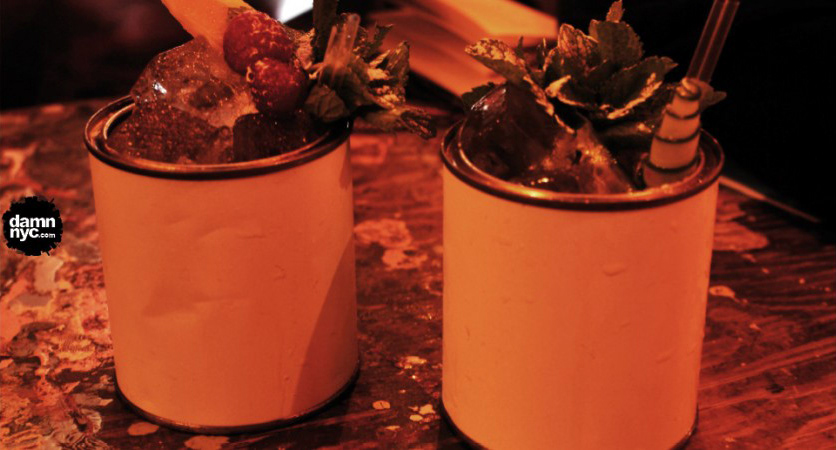
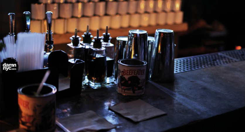
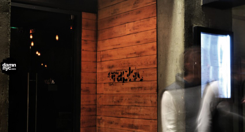
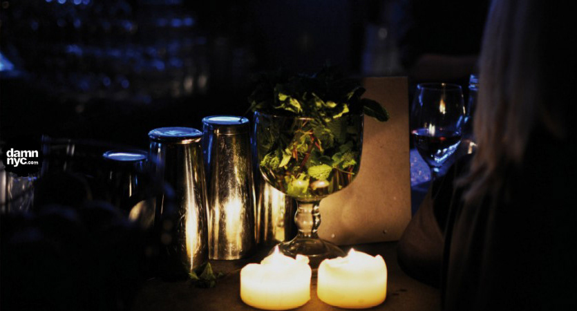
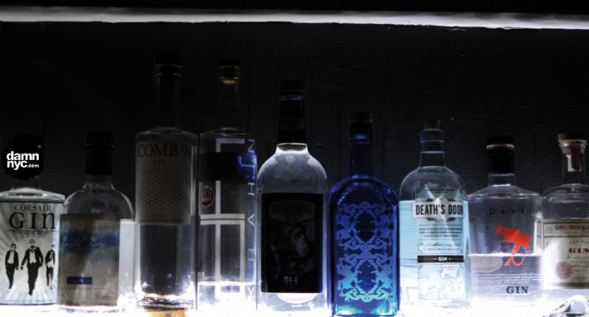
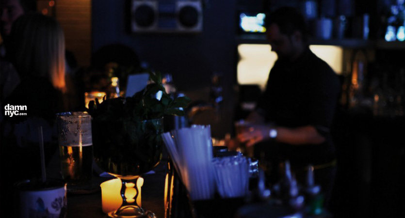
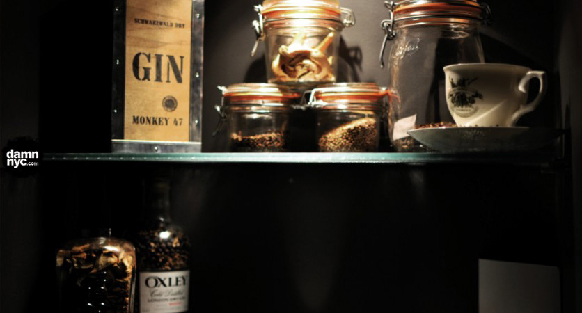
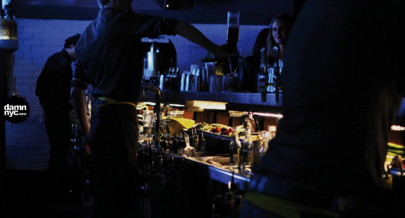
We joined in for a fun & stylish evening at London’s Graphic Bar, and drank gin cocktails from paint tin cans. Sounds different? It was. Depending on your mood or taste preferences, there is a choice of red, green, pink, yellow, blue or white Paint Tin Punches. We had Red and Green (apparently in the mood for Christmas already) and experienced juicy, sweet, gin-infused explosions on our taste buds. The Red Paint Tin Punch is comprised of Beefeater gin, Briottet mixed berry liqueurs, fresh lemon juice, Angostura bitters and cranberry juice. Berry-licious! The Green Paint Tin Punch holds Hendricks gin, fresh mint & cucumber, fresh lemon juice, lemon bitters, and pressed apple juice. Green with envy!
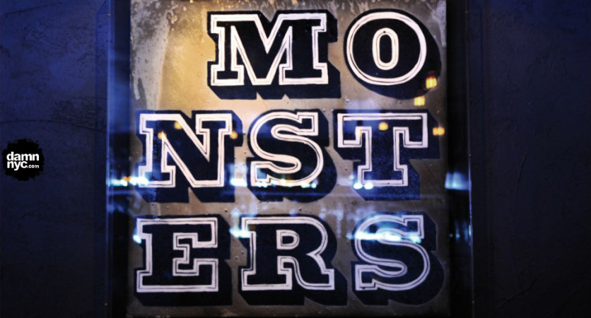
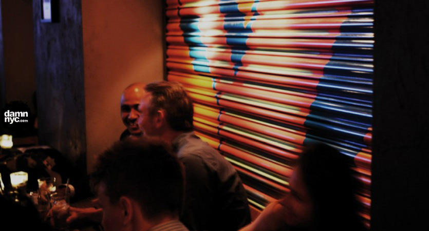
But if you think drinking from a paint tin can gives you an artistic quirk, imagine sitting next to some of the top British urban artists while you sip that cocktail? Graphic showcases artists such as Ben Allen, Eine and Turner Prize winner Mark Wallinger as part of its social atmosphere. You can even sit back & relax, leaning on Eine’s infamous shop shutter typographic walls while you chat to your friends. Eine is located primarily around the streets of Shoreditch, so imagine that outside experience brought indoors.
“The bar’s visitors and its culture are most important,” says Lee, manager of Graphic. On Thursdays, Fridays and Saturdays, Graphic invites DJs to spin cool, deep party tunes. Lee told us that people sometimes dance, and after a few more paint tin cans, I think I’d be dancing too!
The perfect place to grab a bite during the day, sip a cocktail at night and meet with colleagues and friends for a funky, creative night – Graphic is your bar.
Design Museum: Prosthetic Objects, the Digital Crystal and Biodegradable Loveliness
By: Inna Ulanova
Here’s a column to reminisce on the magical happenings and aesthetic loveliness that happened during our trip to the Design Museum in London back in 2012. We’re behind one year, it’s okay – what is beautiful once needs to be reminded to the public that it still is beautiful, and is still out there. Check it out, Lawrence Lek’s prosthetic objects, the digital crystal, and Freyja Sewell’s sustainable, fashionable material experiments.
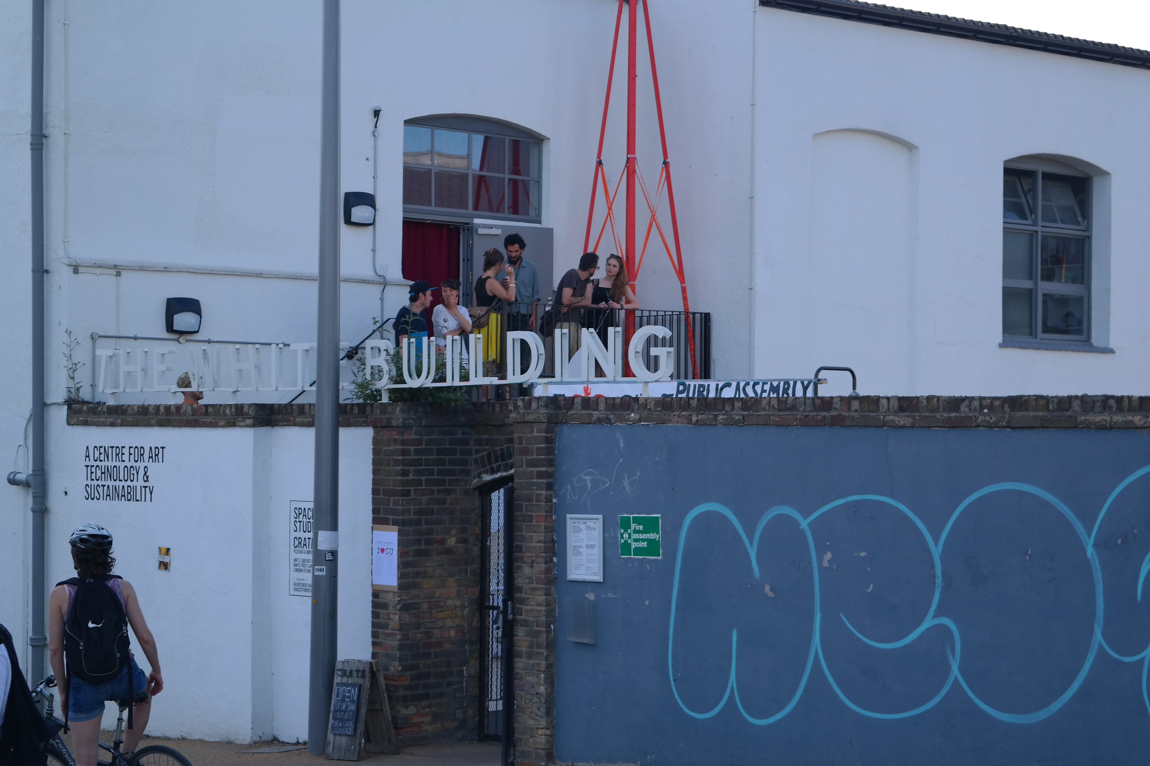
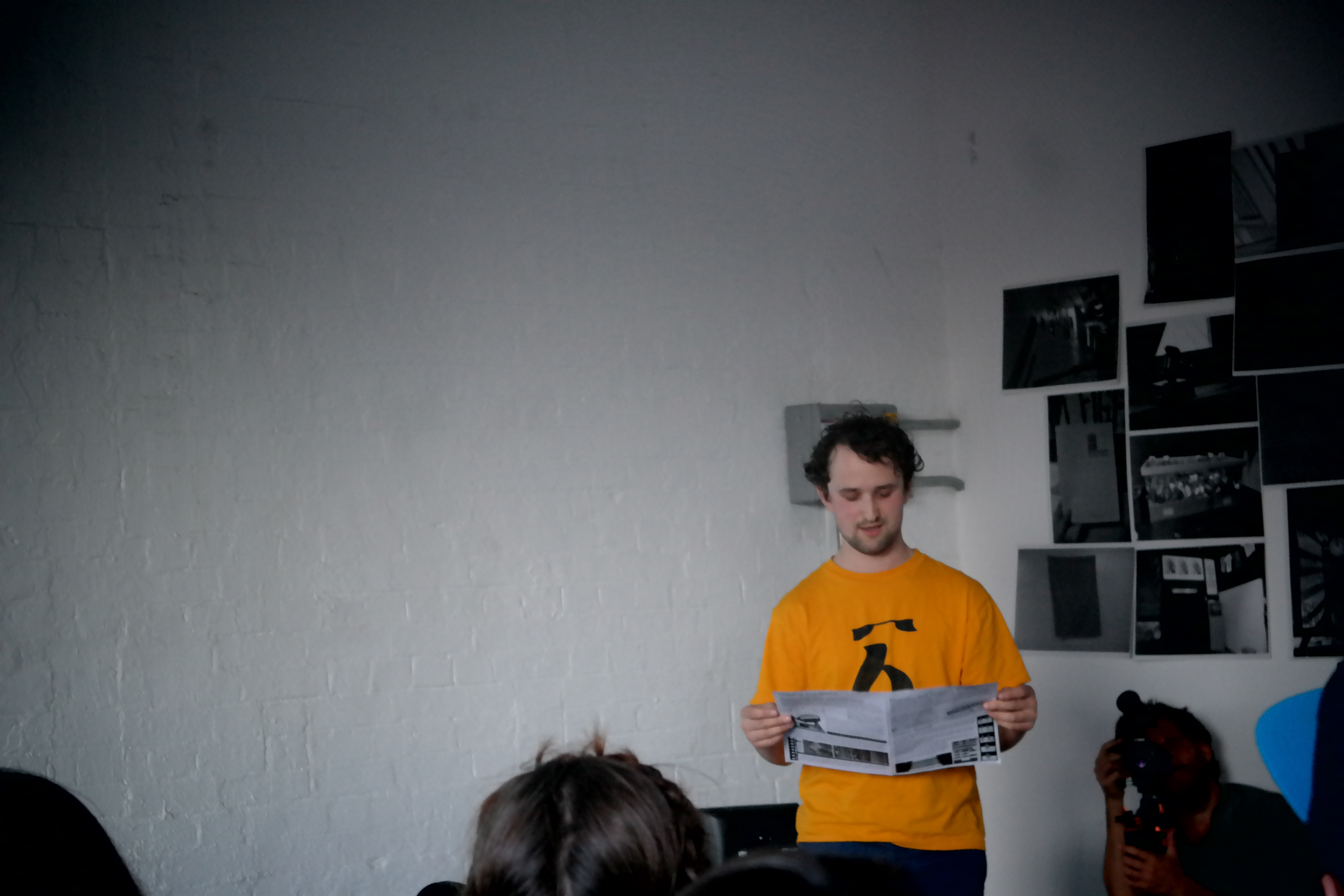
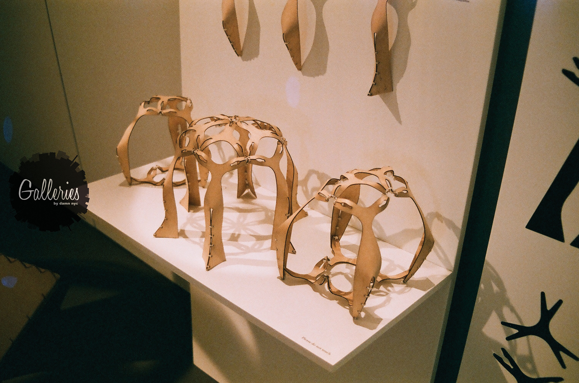
Now Lawrence Lek, we met him and he’s a great artist. He creates his work and backs other works without any hesitation in contrast to some egomaniac artists. After attending the Public Assembly at the White Building in Hackney Wick, we were blown away by the creativity that East End has to offer – especially the fact that Lek works in those regions for a reason. But okay, that’s a separate article. At the Design Museum, he created the Unlimited Edition, a series of bent plywood figurines which were* combined to create a large sort-of gazebo, symbolizing that constructs and the environment (should) be and sometimes are inseparable. His constructs organically transition into a large playground for users to decide themselves what these structures stand for, pure subjectivity. Awesome. This sculpture & architect is something special and we’re so glad to have met him and see his work face to face. The Unlimited Edition was created during his 2012 Residency at the Design Museum. Lek is now working on prosthetic objects which involve the body and our awareness of nature. This again is a smooth transition reflecting how design serves such a clearly defined purpose – it reminds us of our basic selves, needs and of course, of beauty.

© Inna Ulanova
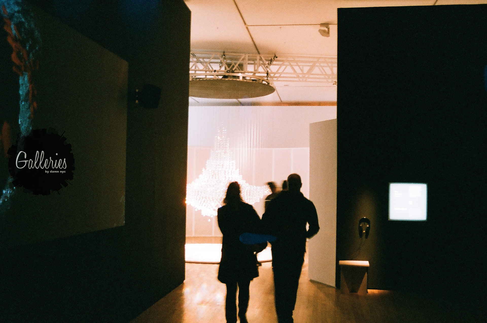
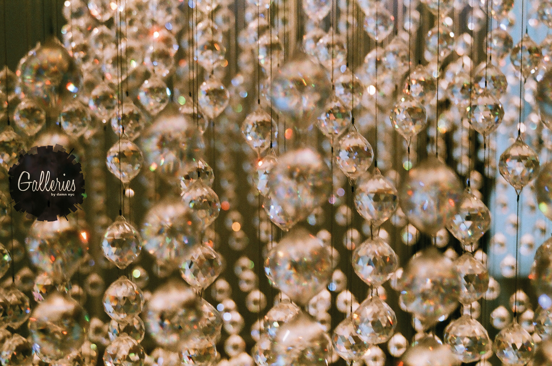
Moving on to the Digital Crystal which was showing at the Design Museum. Who doesn’t love Swarovski crystals? So dating back to 1895 when Daniel Swarovski invented the machine which was able to create these beautiful gems, which not only meant this inspired bling bling but also modern art, design, fashion and cinema for the future to come. The digital crystal was a collaborative effort between the Design Museum and Swarovski and a new generation of designers. What would you create if you were provided like 1,000,000 Swarovski crystals? Me personally, I’d put that shit all over my body and just become a walking crystal ball. Dream on Inna.
This last gem, oh my god, I think I fell in love with her work as soon as I saw her Hush chair, 100% made of wool. Freyja Sewell is the name. For this, I had to visit her website to follow the buzz. Wow, wow, wow. It’s like my dream chair for working. In fact I’d live in that chair. However the nice analog Nikon F501 camera I used for the day wasn’t fast enough to take all snaps of her work, so I have just this lamp. Sewell works with natural, biodegradable materials focusing on sustainability. Her work is available to purchase, and it’s affordable design! Check her website for better reference, you won’t be disappointed. If you’re into sustainable, natural living – she’s your gal.
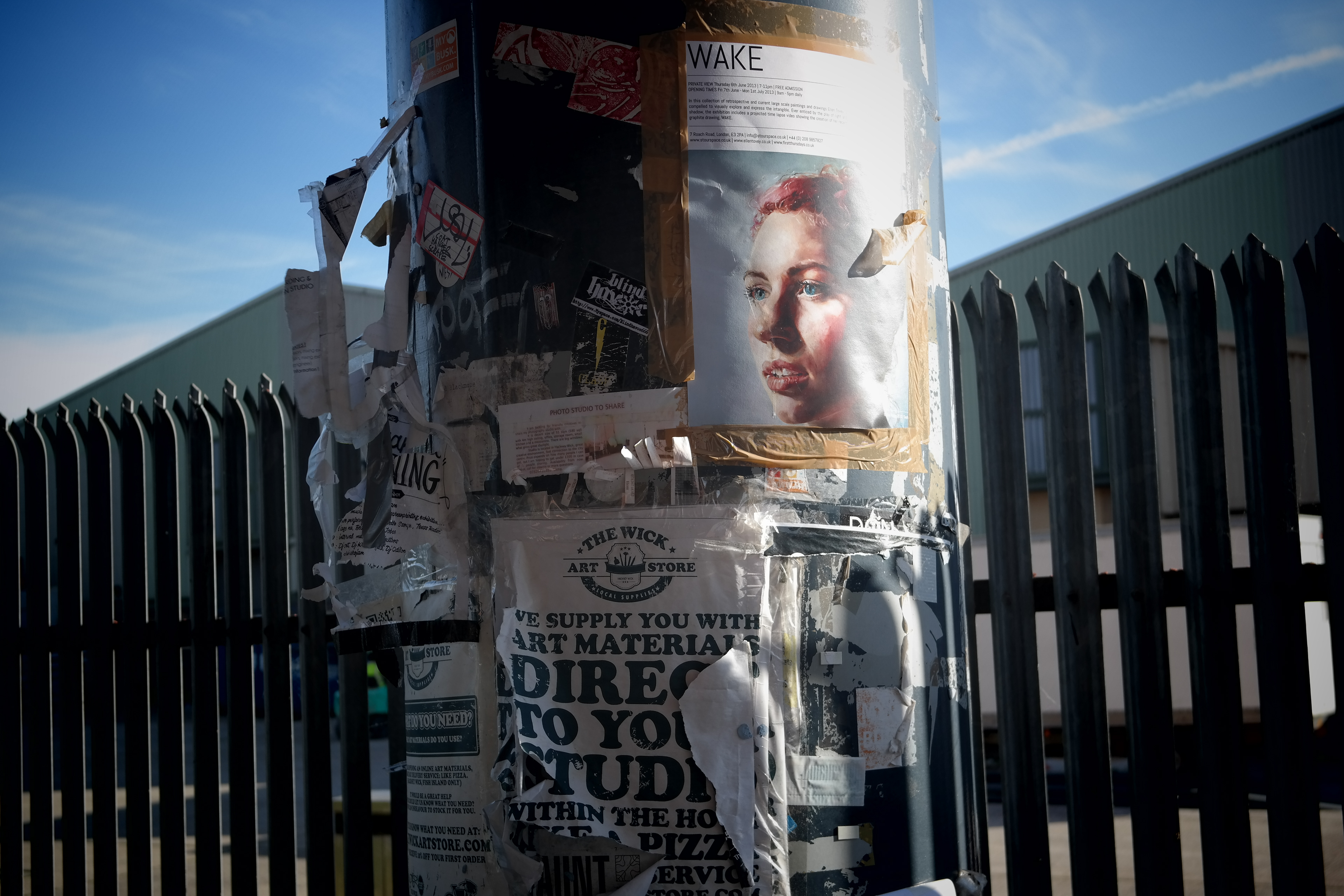
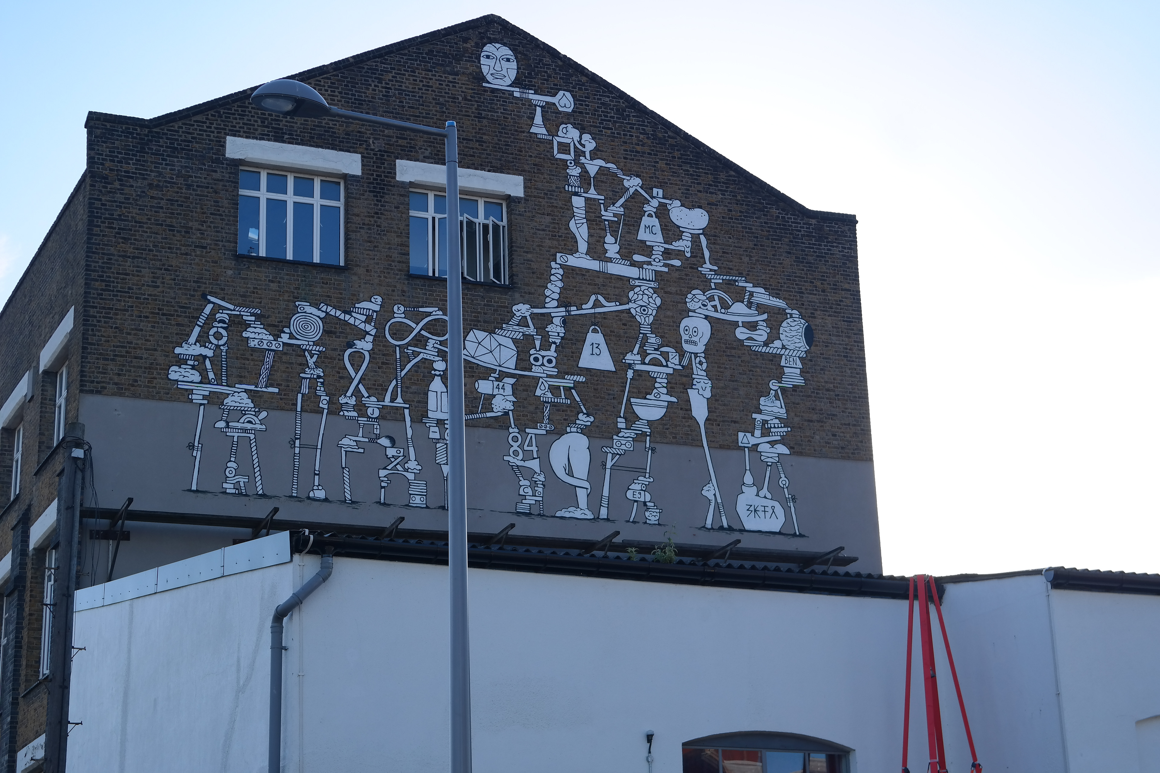
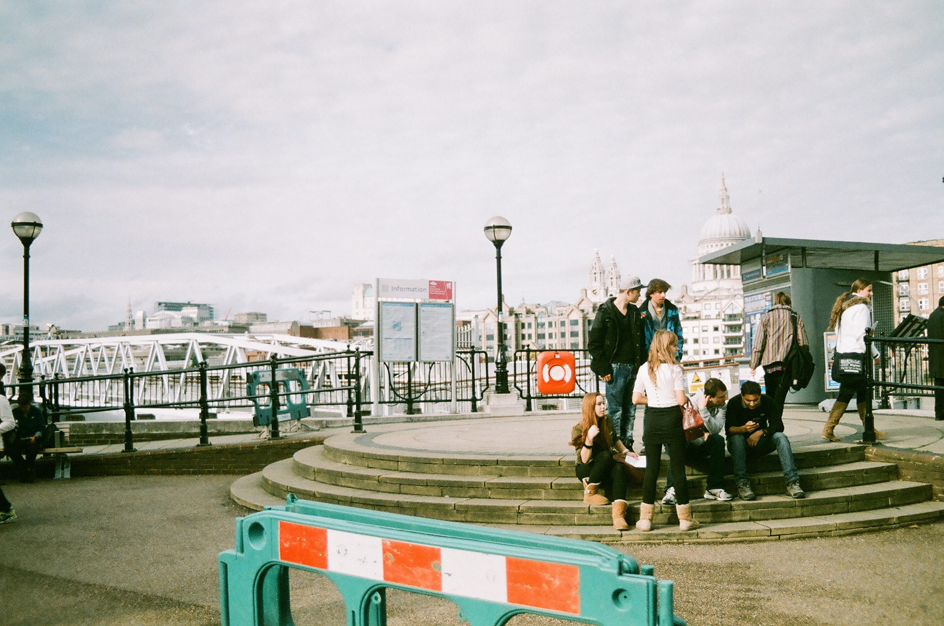
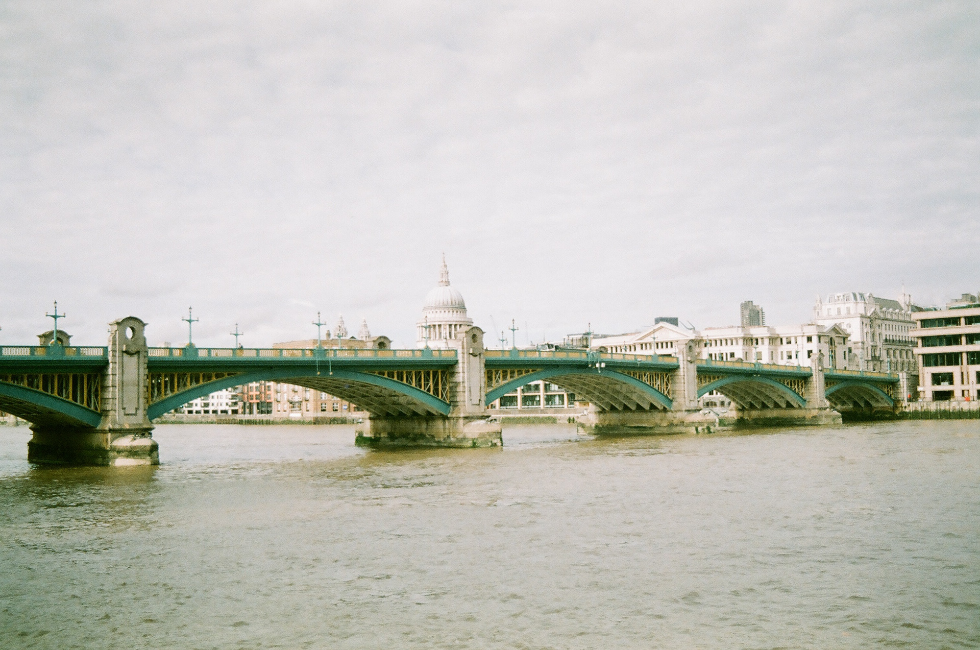
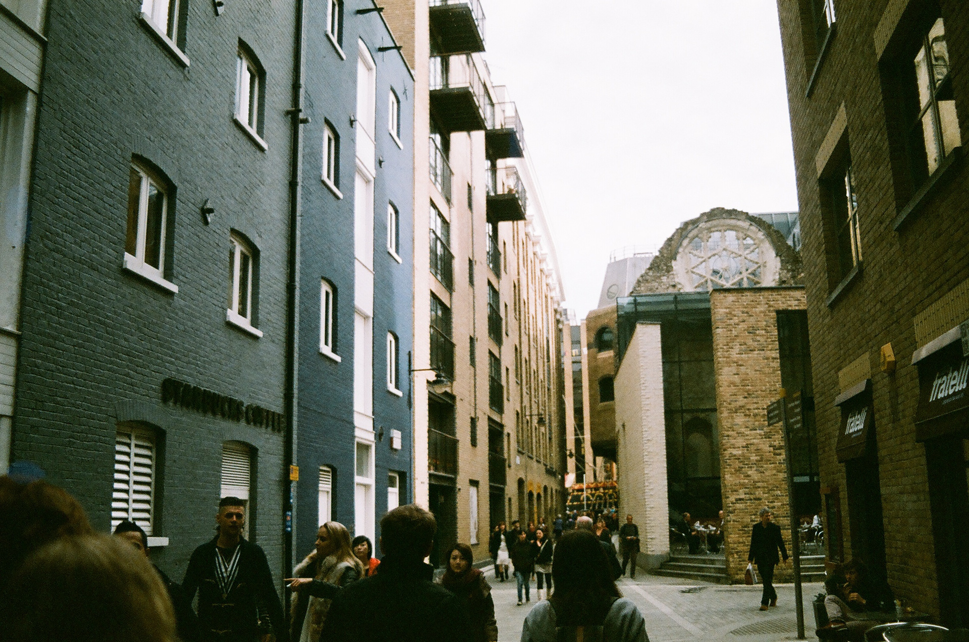
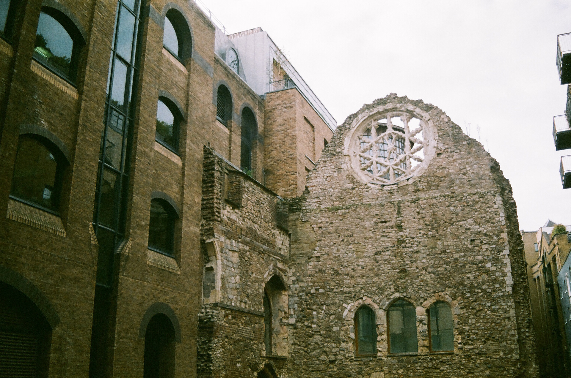
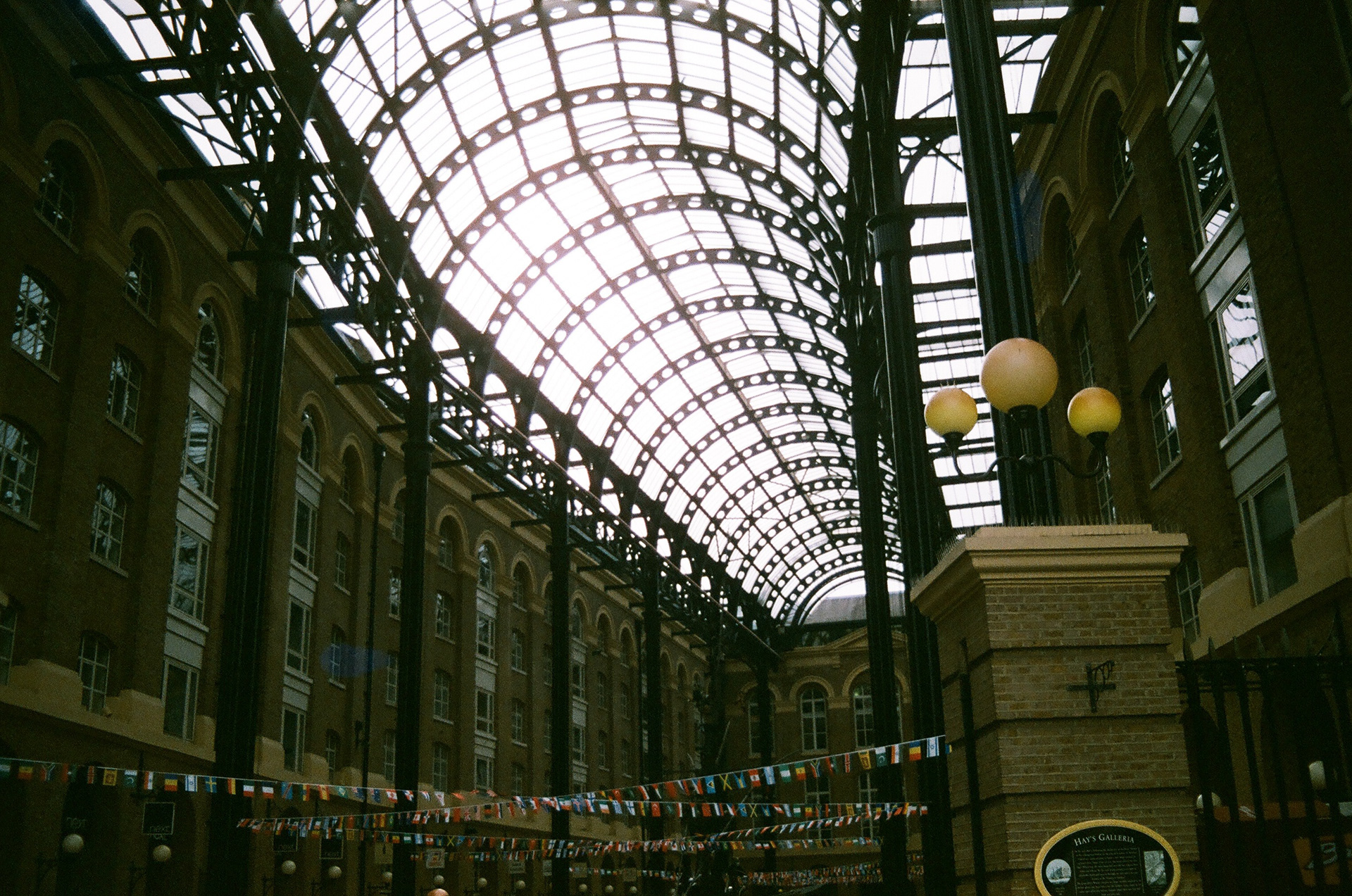
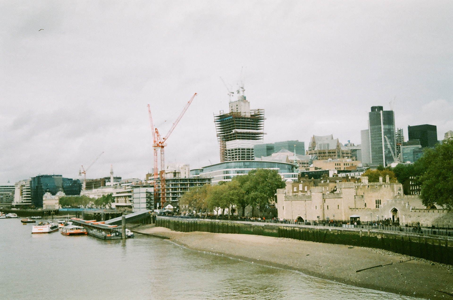
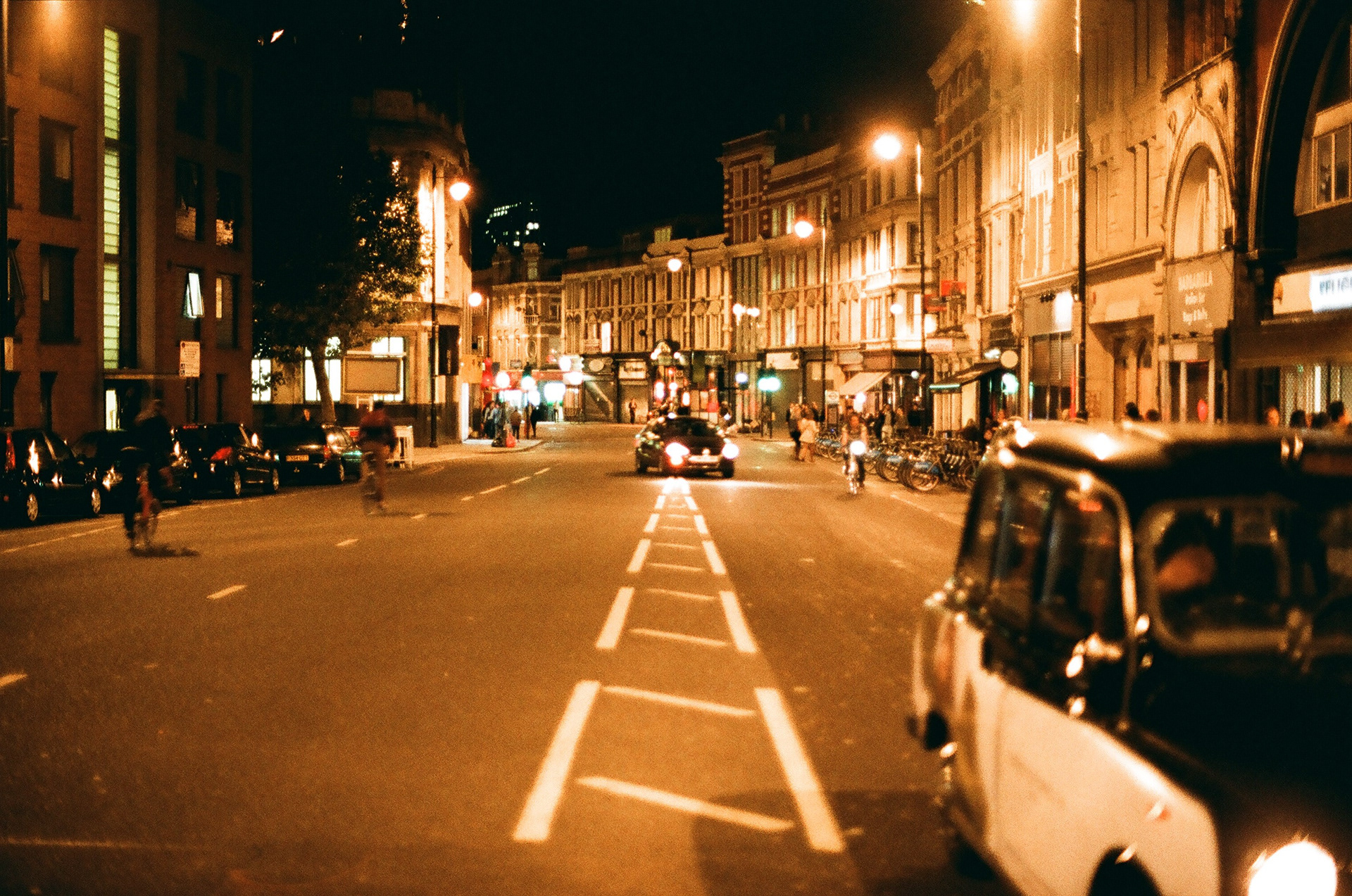
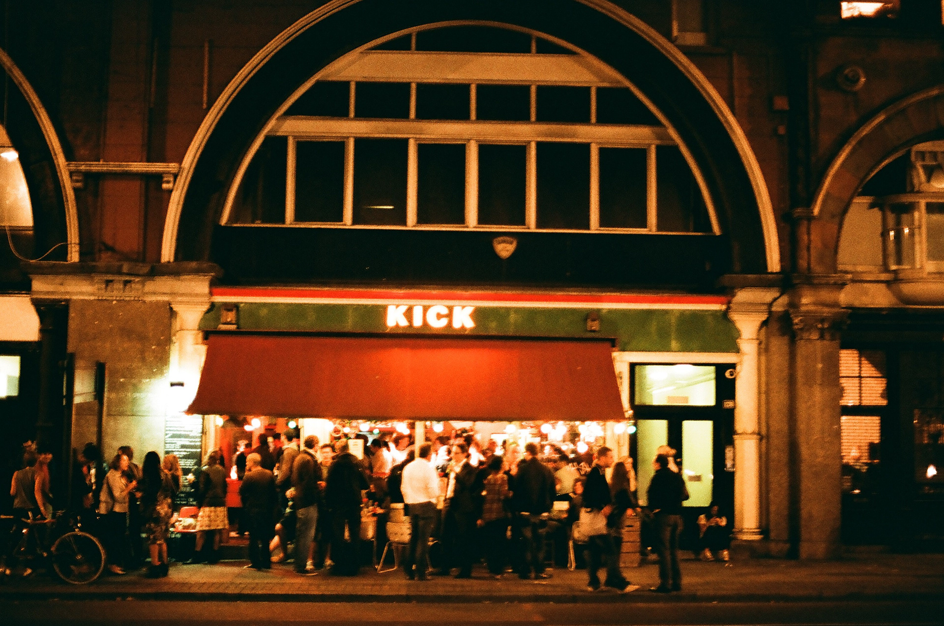
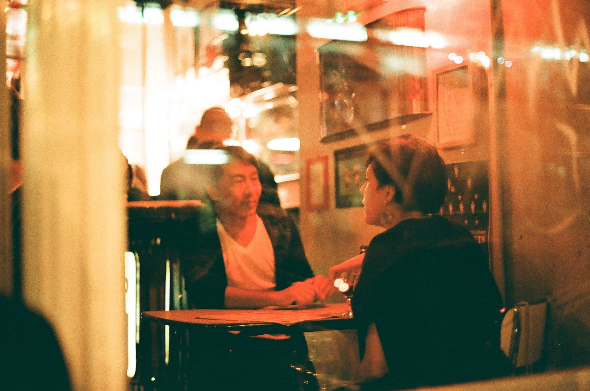
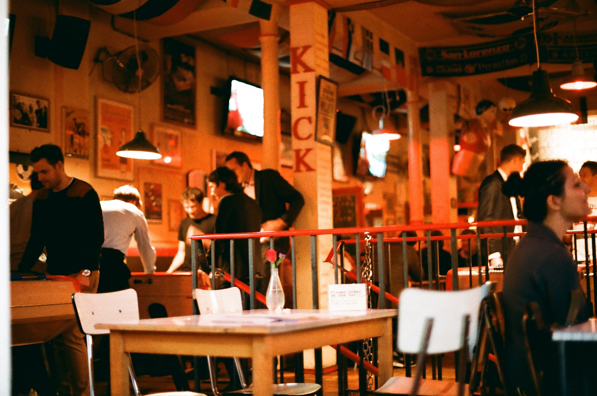
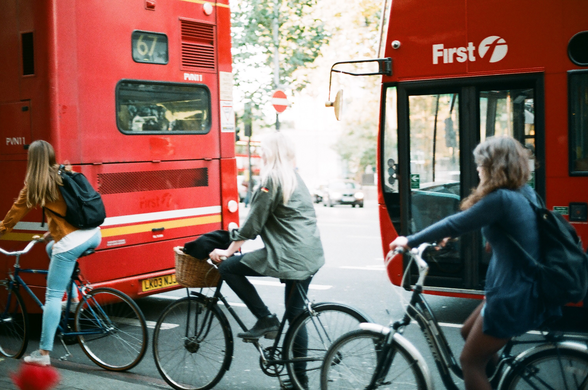
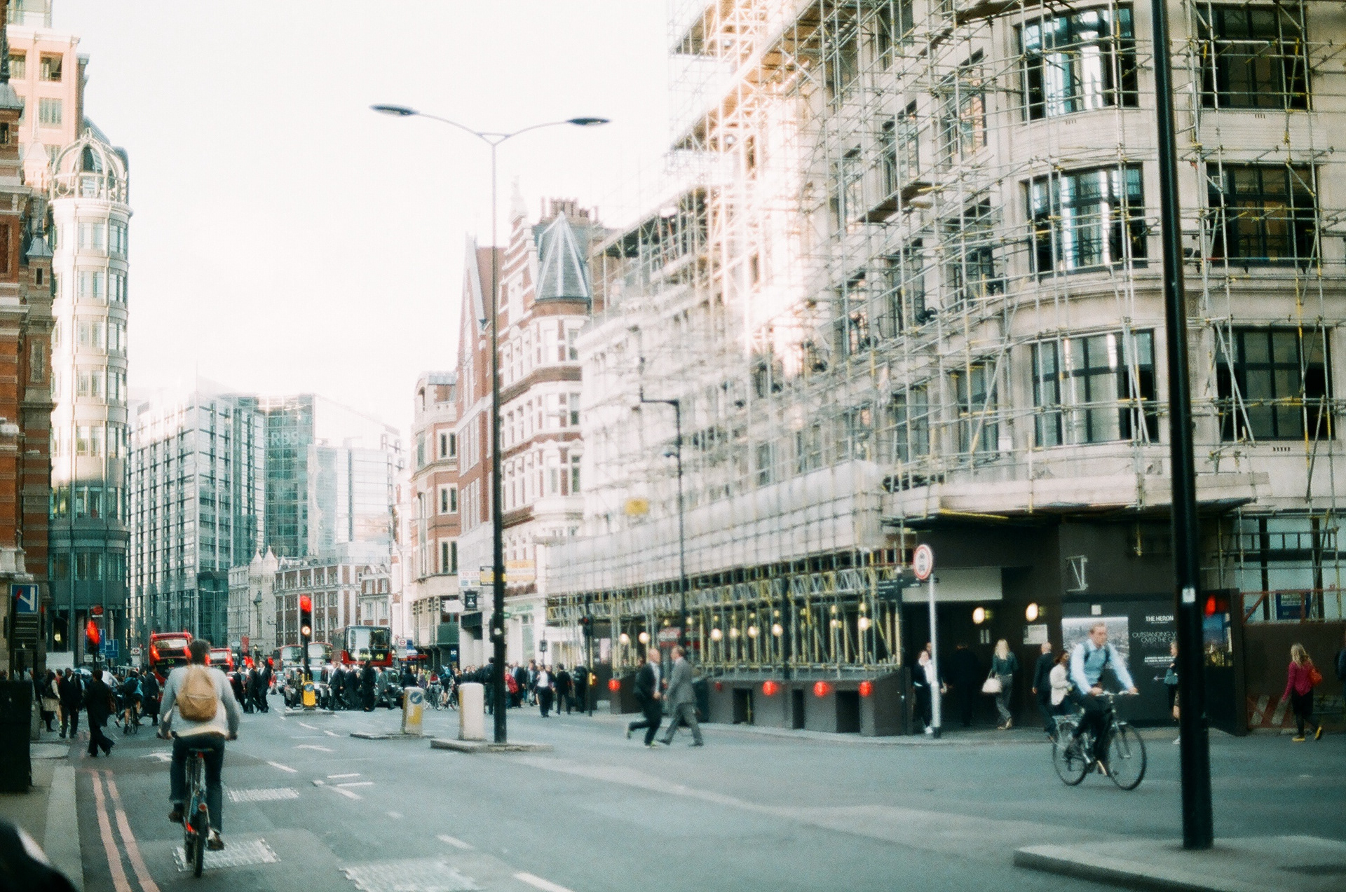
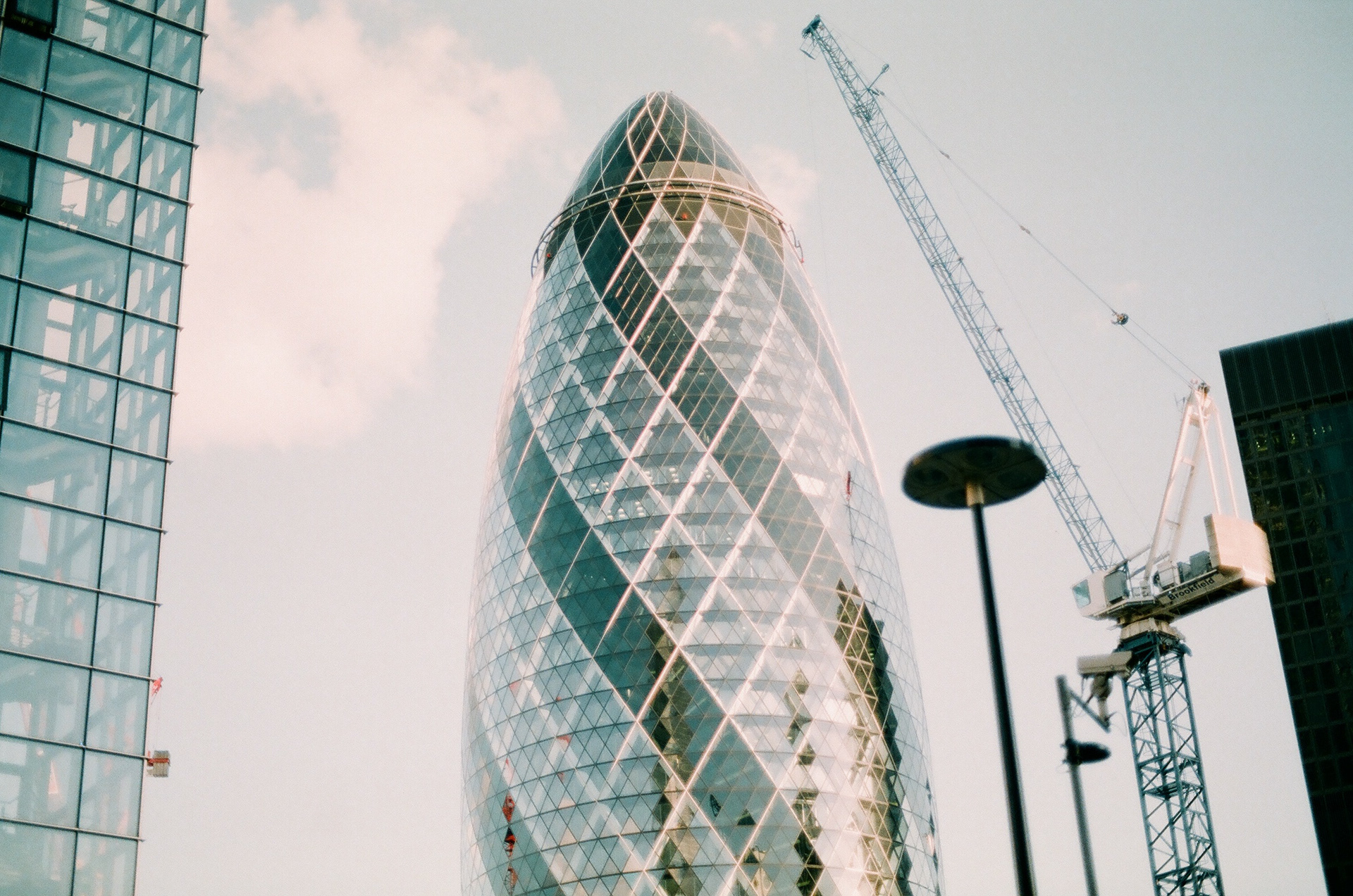
Photography: London
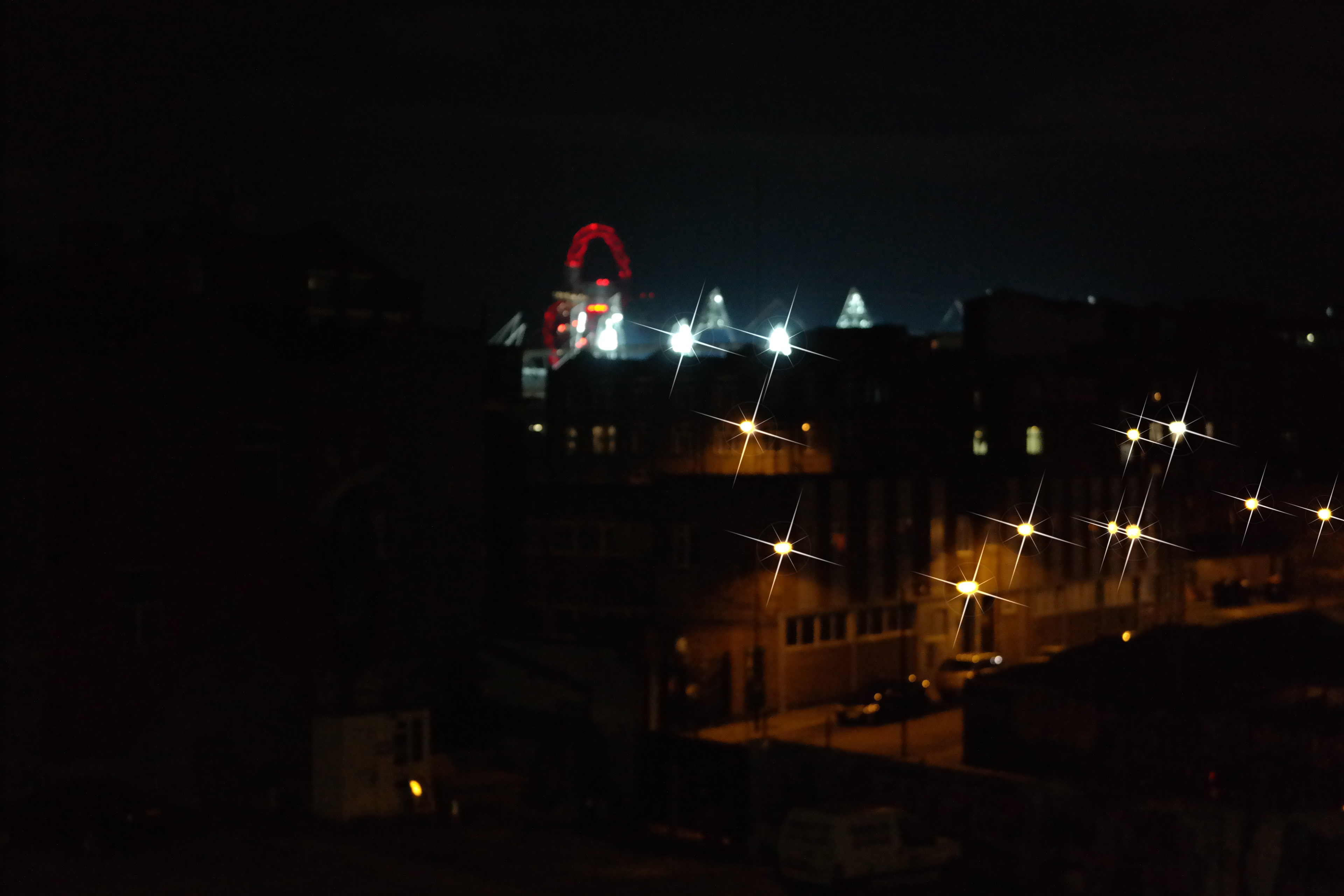
Some London-inspired photography shot with Nikon F501
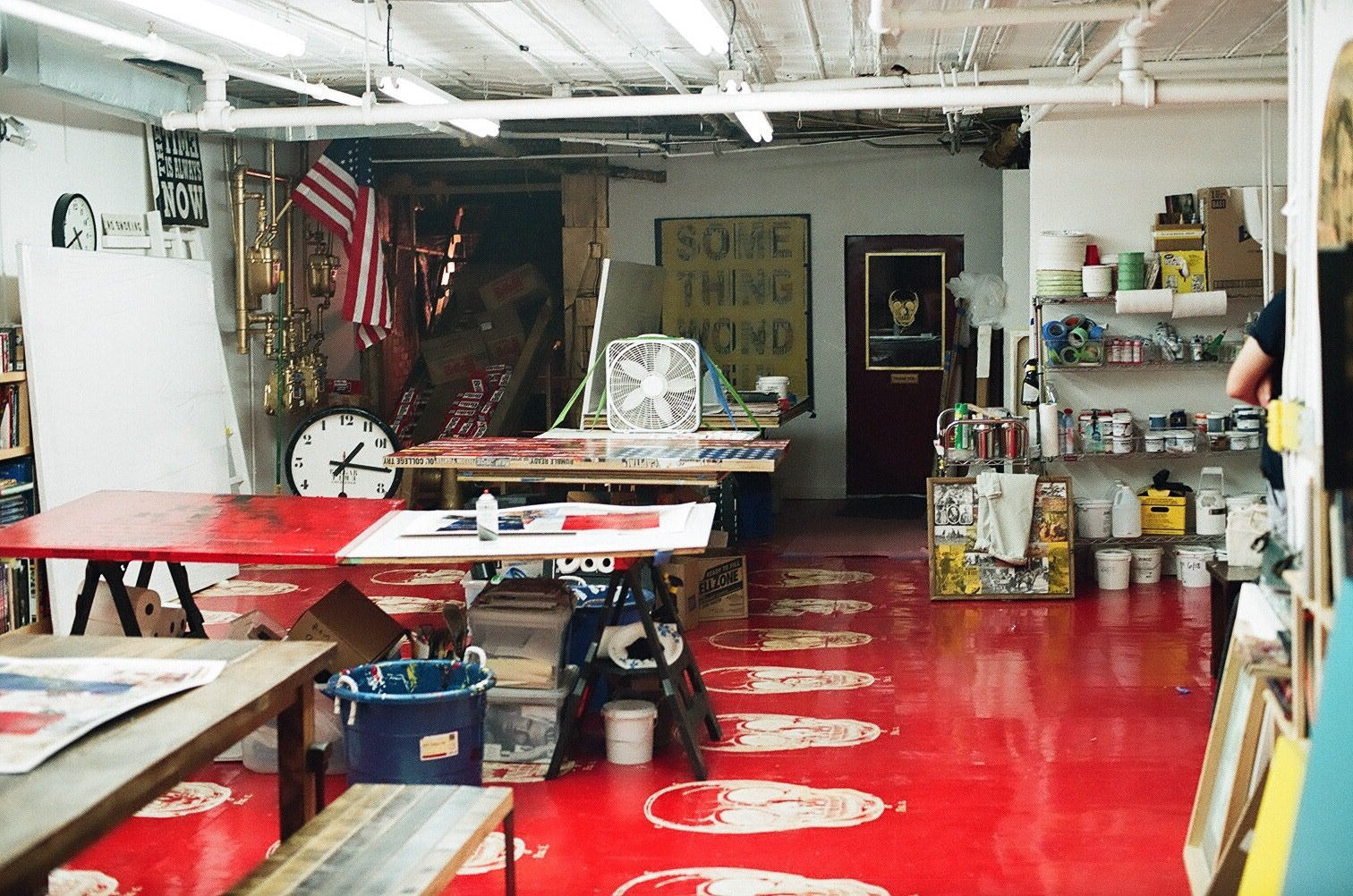
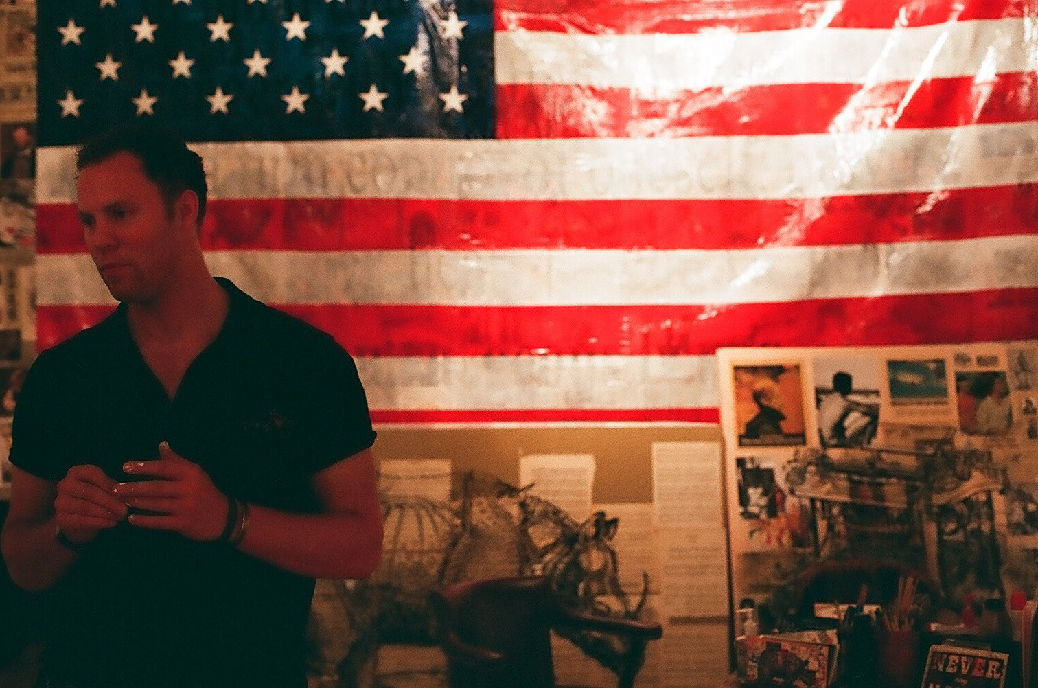
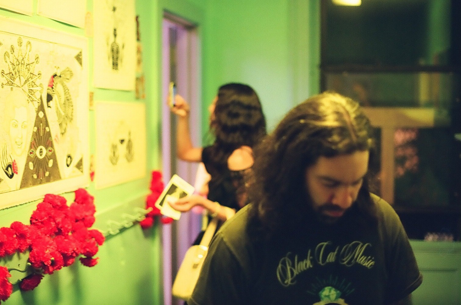
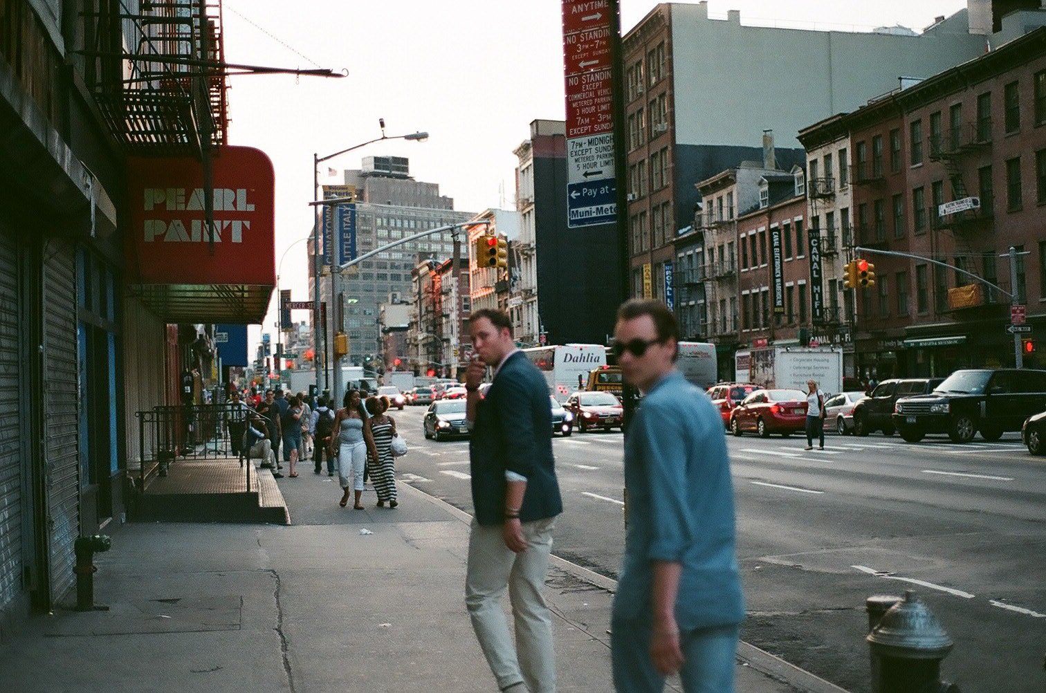
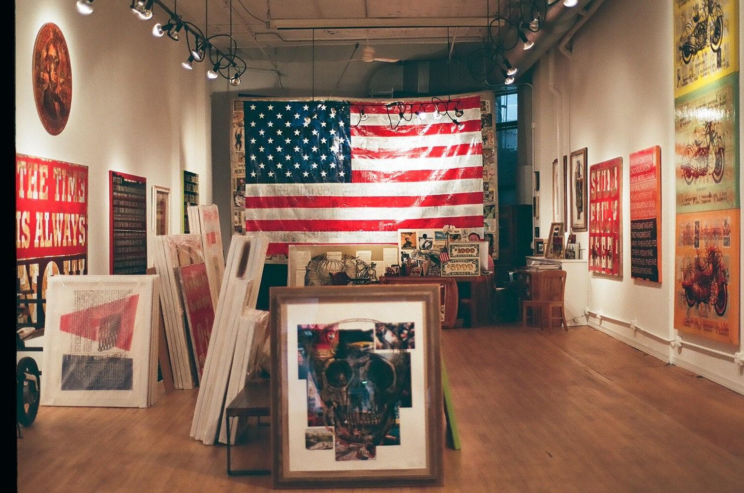
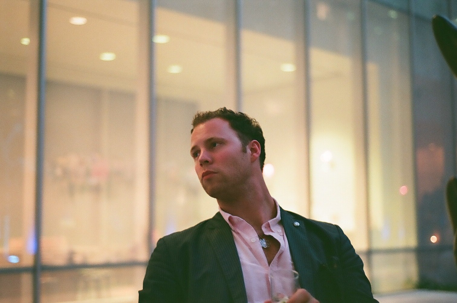
Photography: New York
Some New York-inspired photography shot with Nikon F501
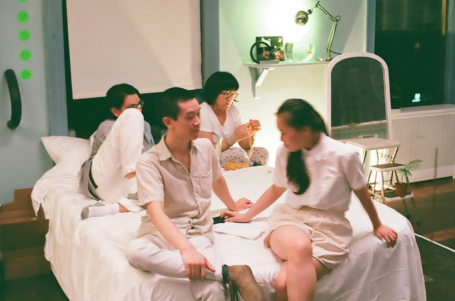
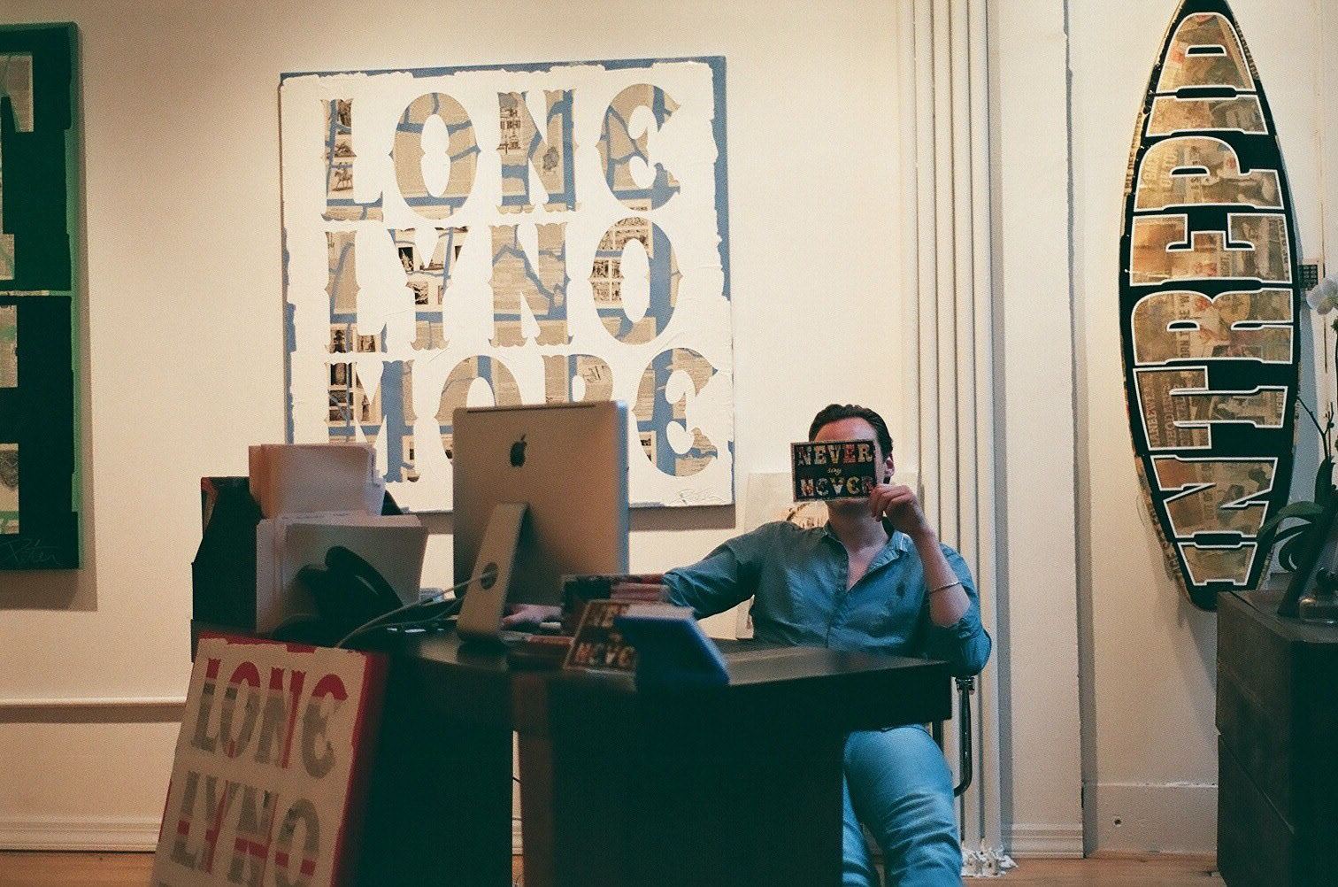
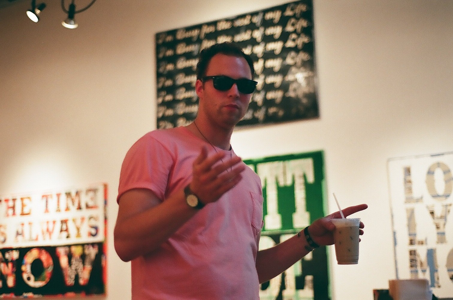
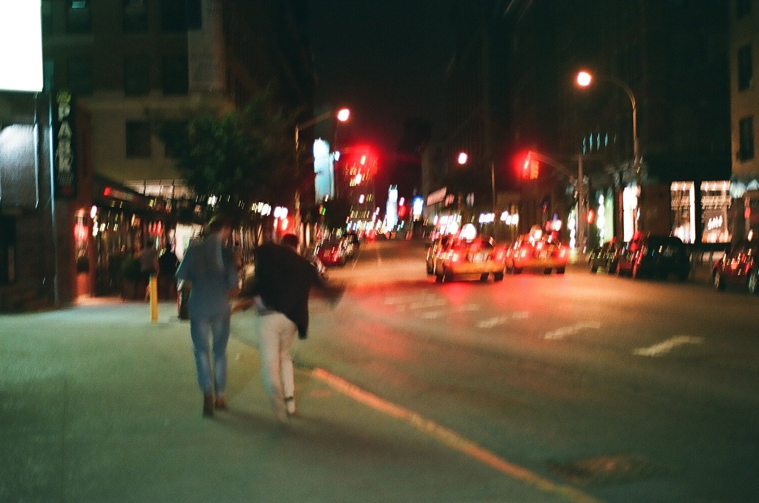
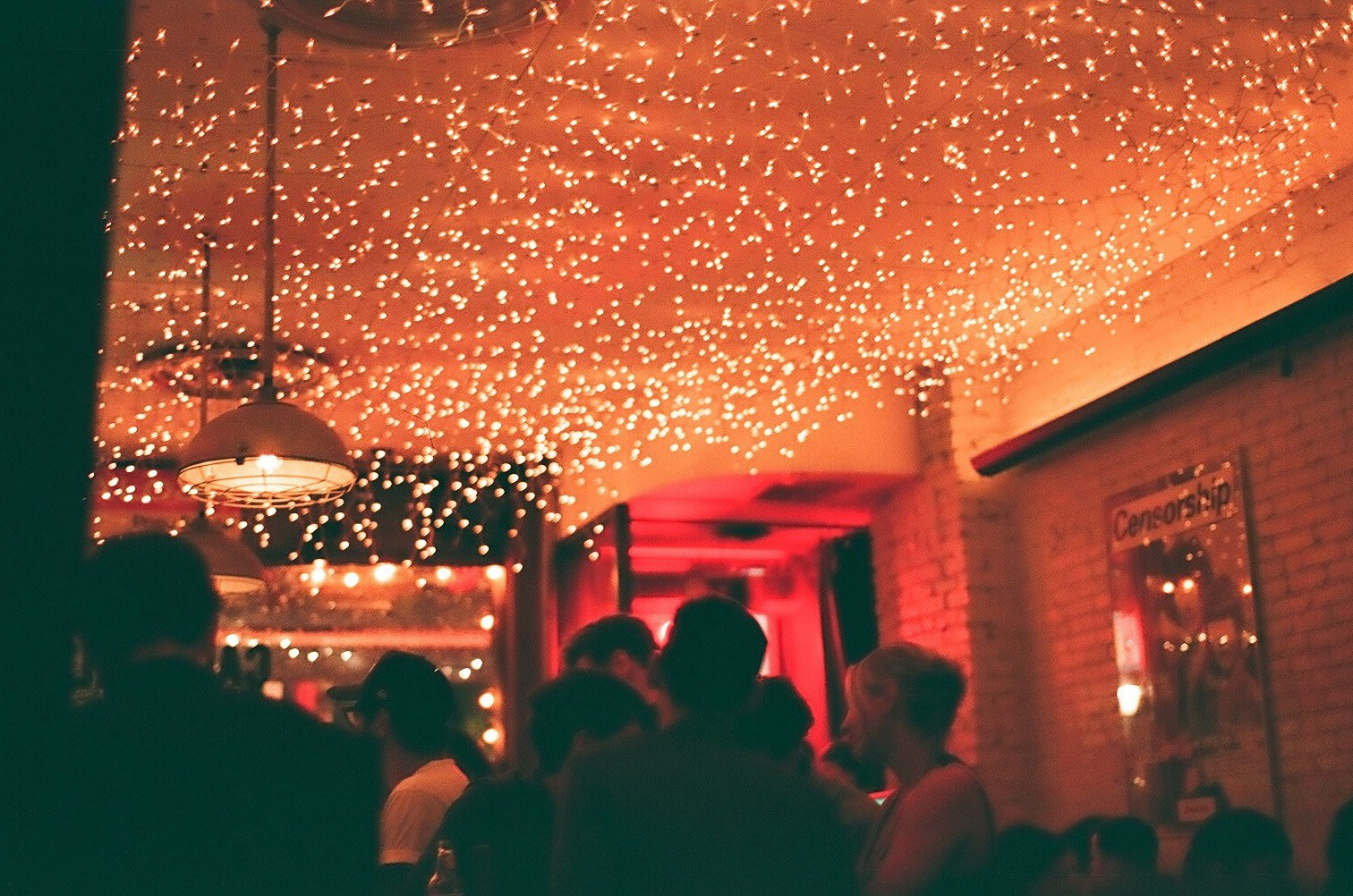
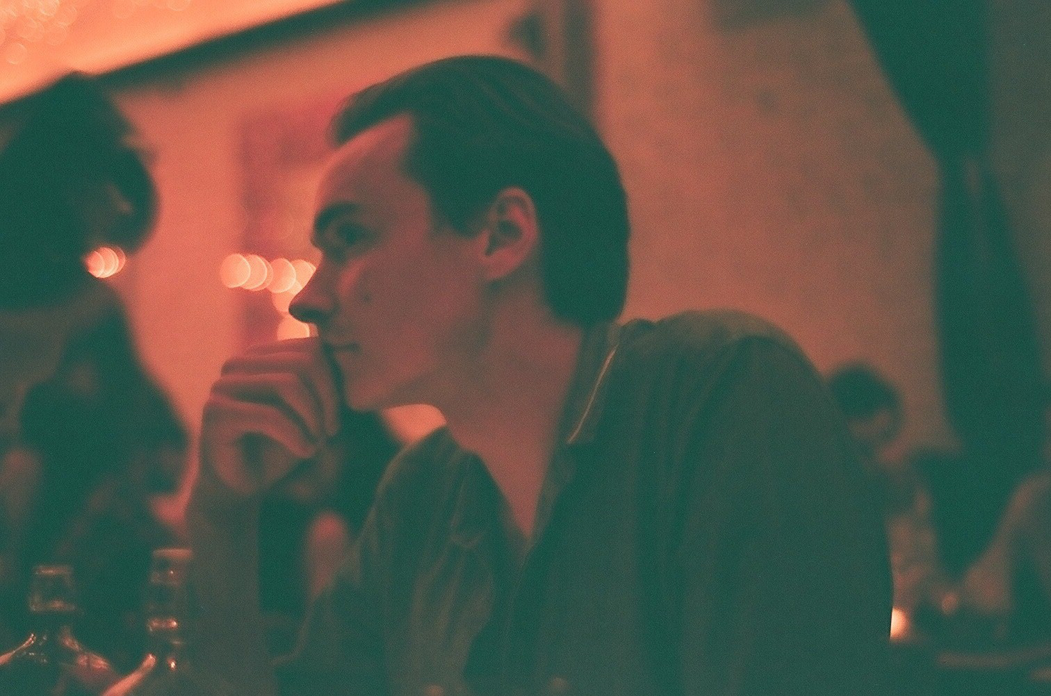
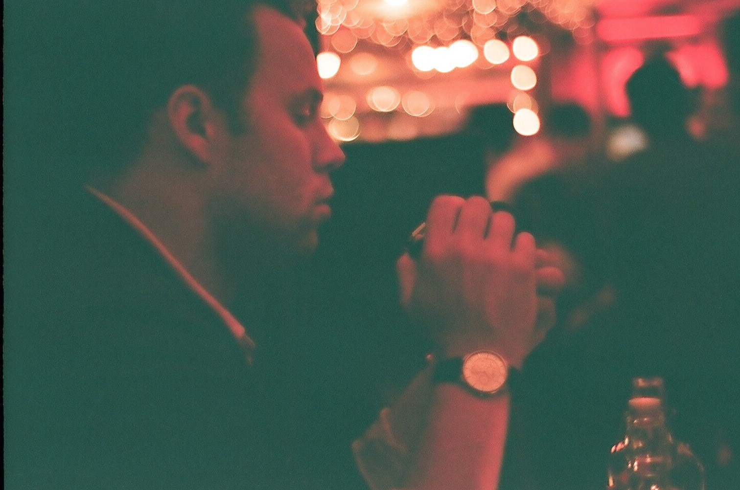
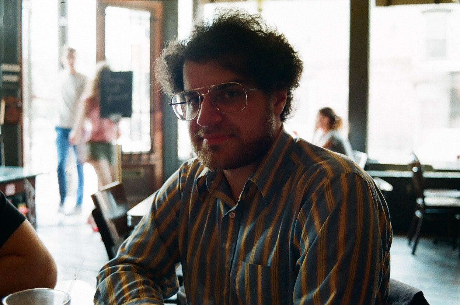
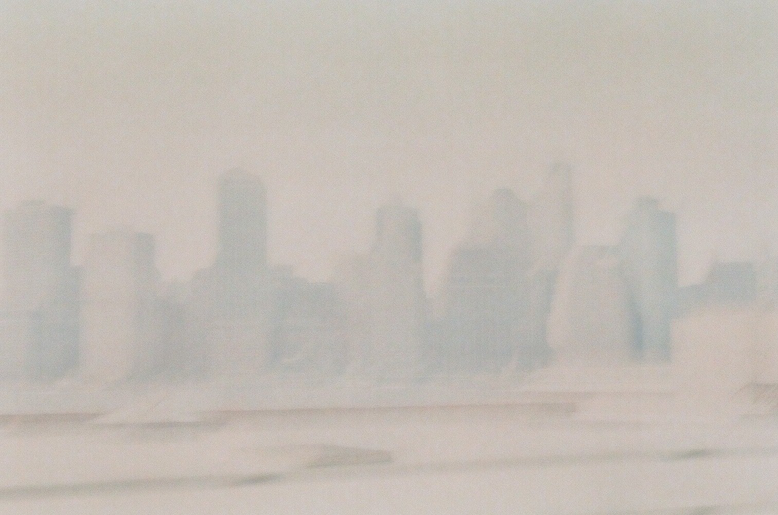
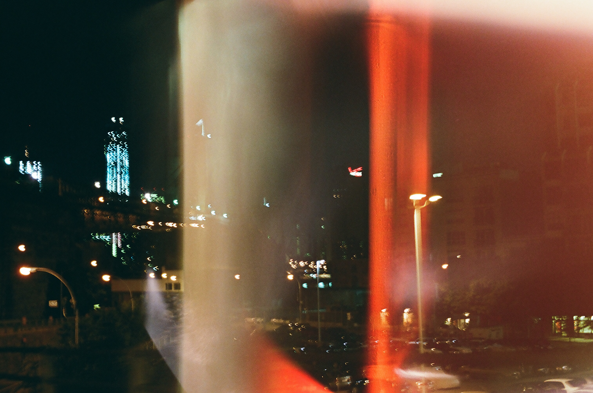
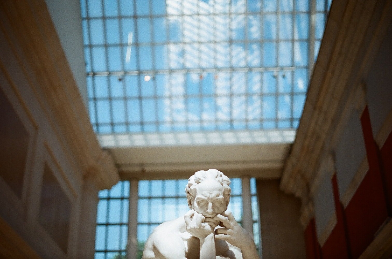
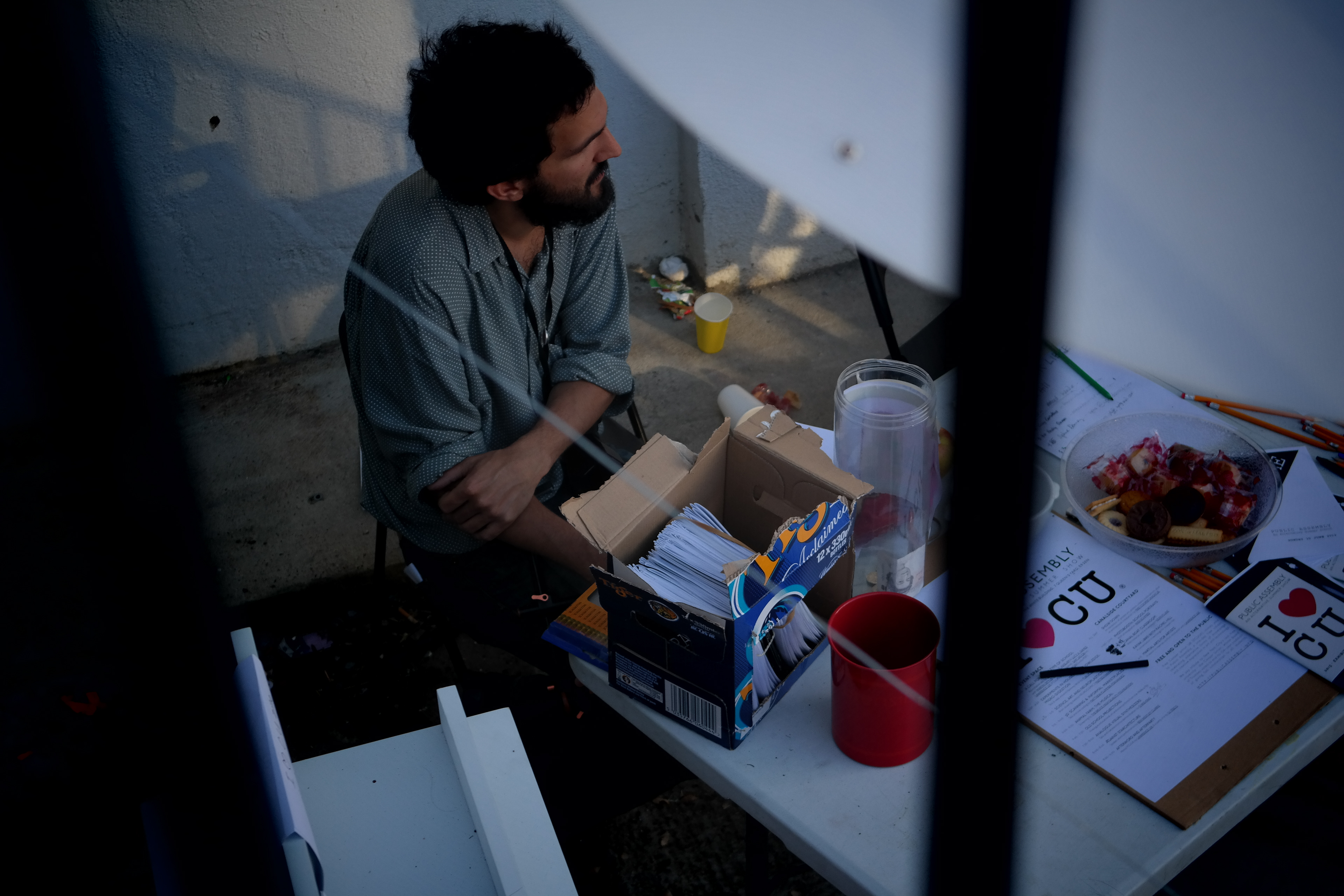
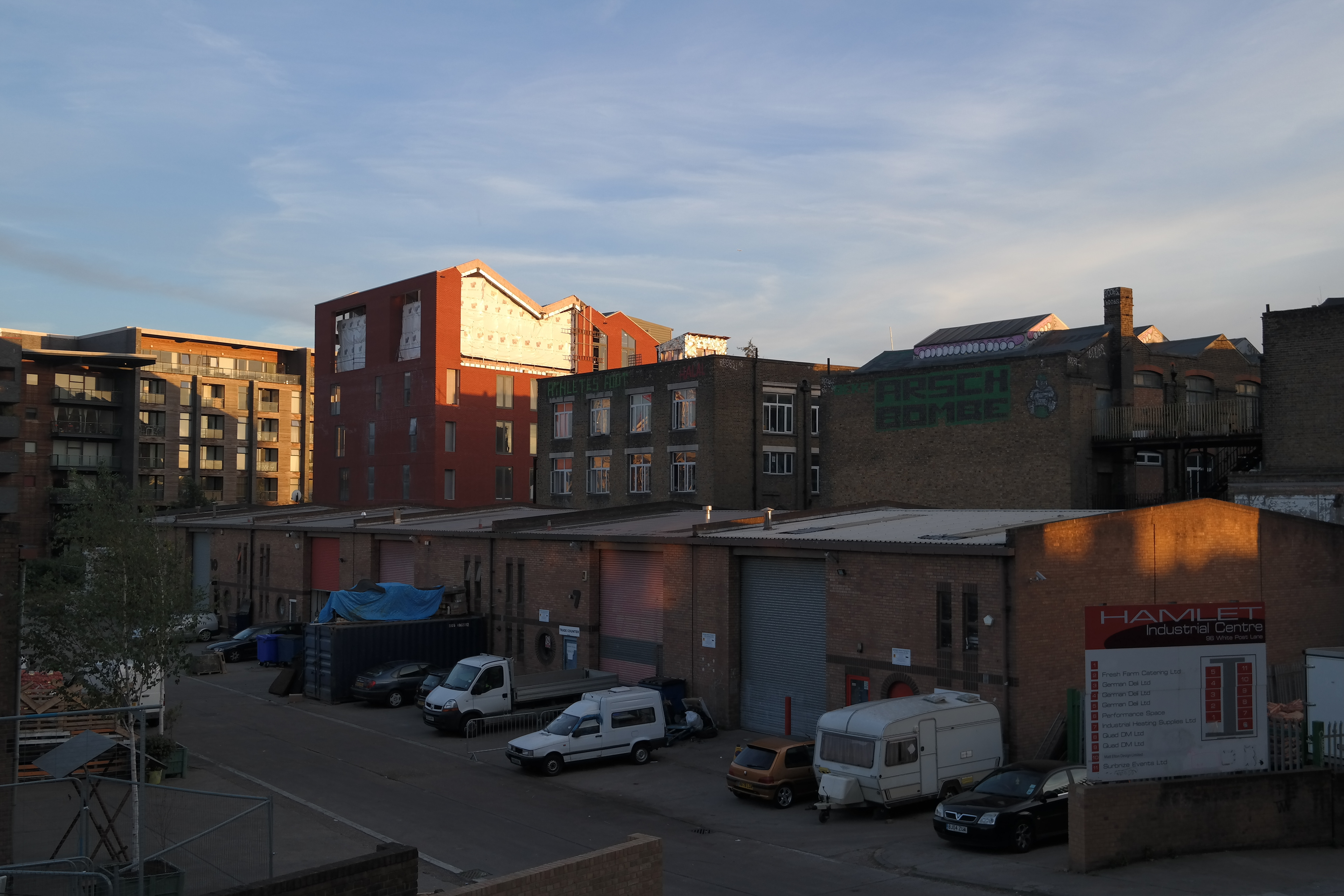
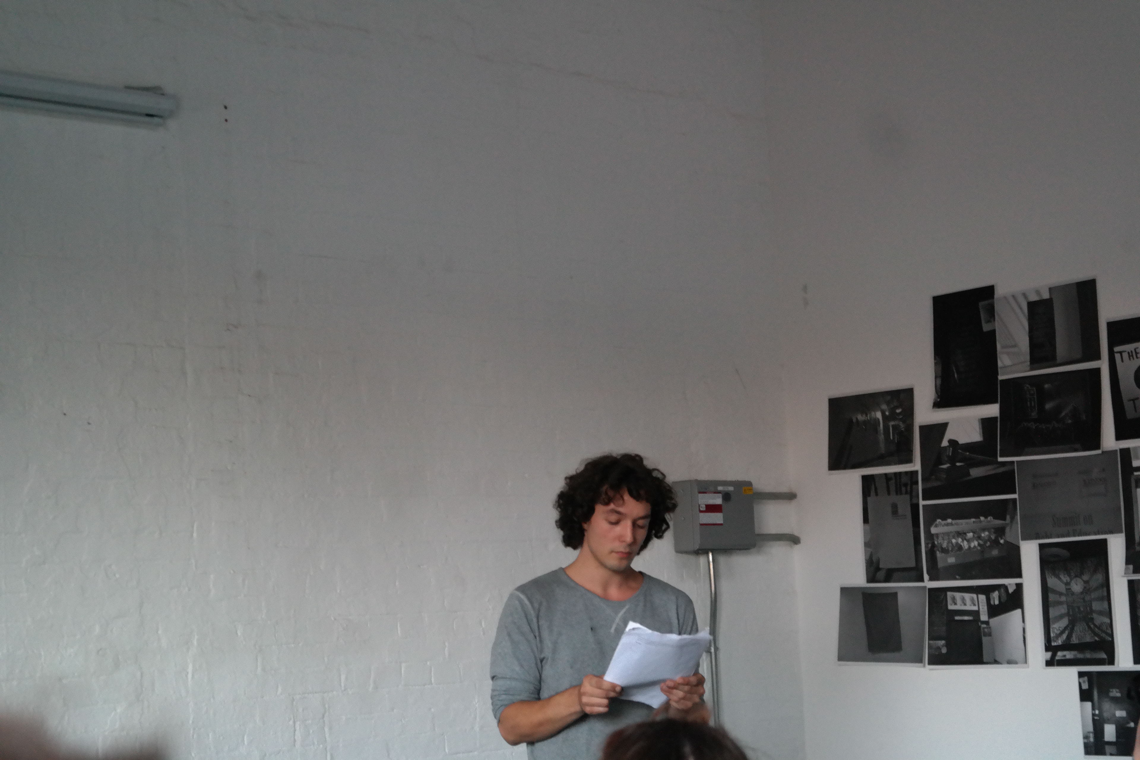
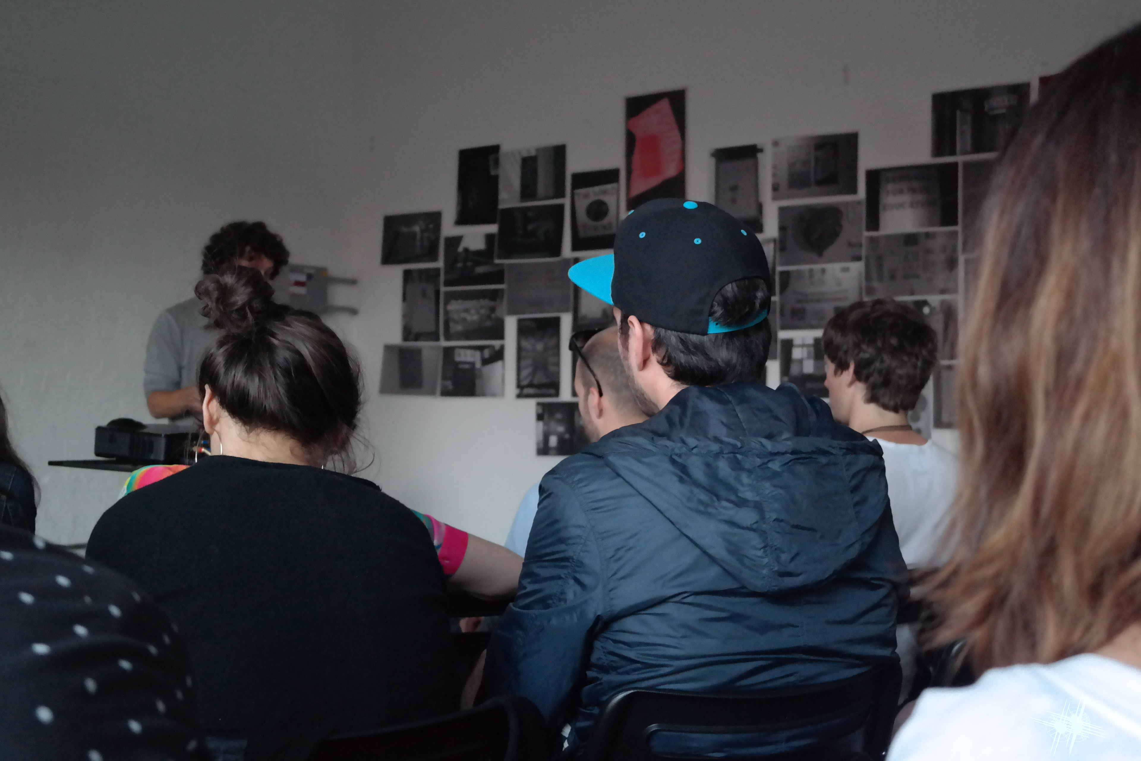
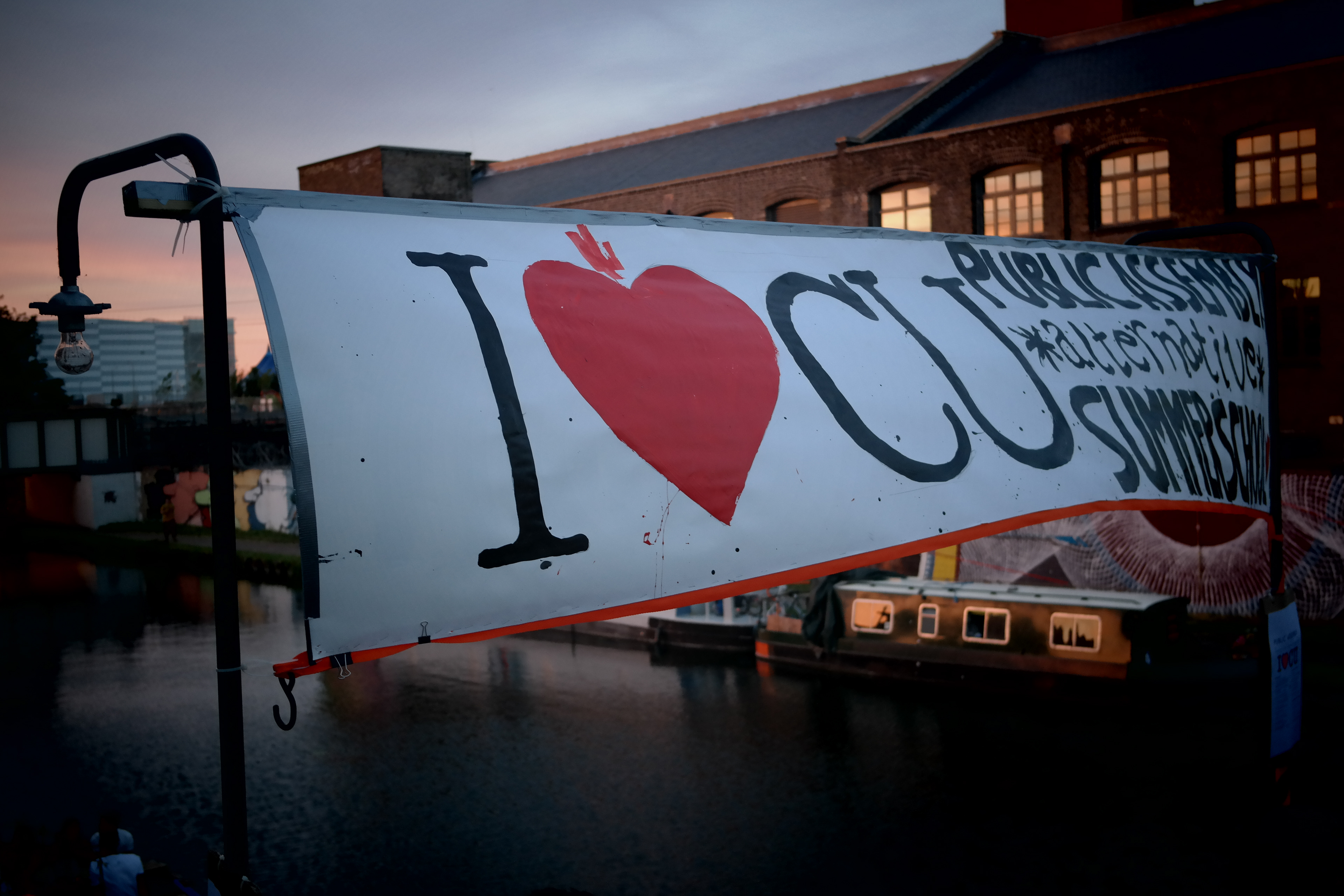
Photography from Public Assembly (Hackney, London)
Shot with Canon DSLR EOS Rebel
